PAXMotion is a visualization system for public transit planners and policy makers to better understand and explore passenger demands. PAXMotion is an interdisciplinary research project developed by computer science and design students of the University of Applied Sciences Mannheim, in cooperation with the Rhein-Neckar-Verkehr GmbH, the public transport company operating in Heidelberg, Mannheim, and other cities.
Background and motivation
The project started with a design thinking workshop to get to know the problems that transit planners of the RNV face every day. Furthermore, also we were supposed to tell their needs from the customers view as most of us use public transport daily. At the end of the workshop lots of issues had been collected, which the system to be developed aims to solve by visualizing certain datasets.
Goals and tasks
Because of its explorative character the only goal of this project was to visualize data, but neither which data nor which visualization techniques should be used were defined. So it was up to us to decide on what kind of dataset we would like to visualize. Also we had to explore which visualization technique fits the chosen dataset. This kind of didactic method requires an agile project management method. Each team member could work on tasks which he/she wanted to. The tasks were clear: besides the dataset and visualization technique, we had to decide on the backend architecture and frontend frameworks they would use. Except technical tasks there were also tasks to organize the teamwork and to schedule the project phases. Never the less, the procjet took place during a lecture, so there had been some higher goals we students had to achive. We should gain a deeper understanding of what it means to visualize data and which aspects are important. In the previous semester we already learned some visualization skills which should be deepend.
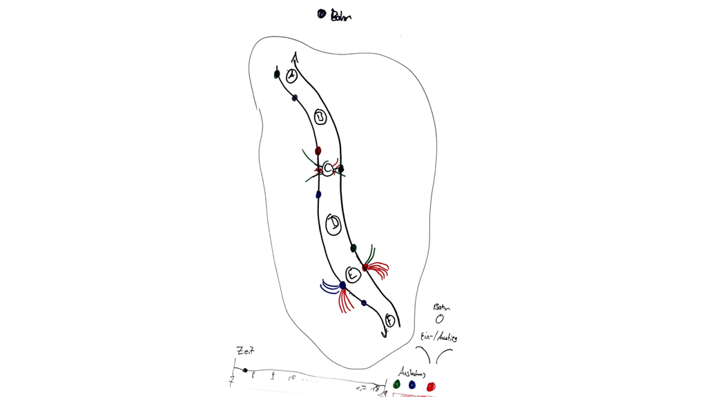
The visualization system
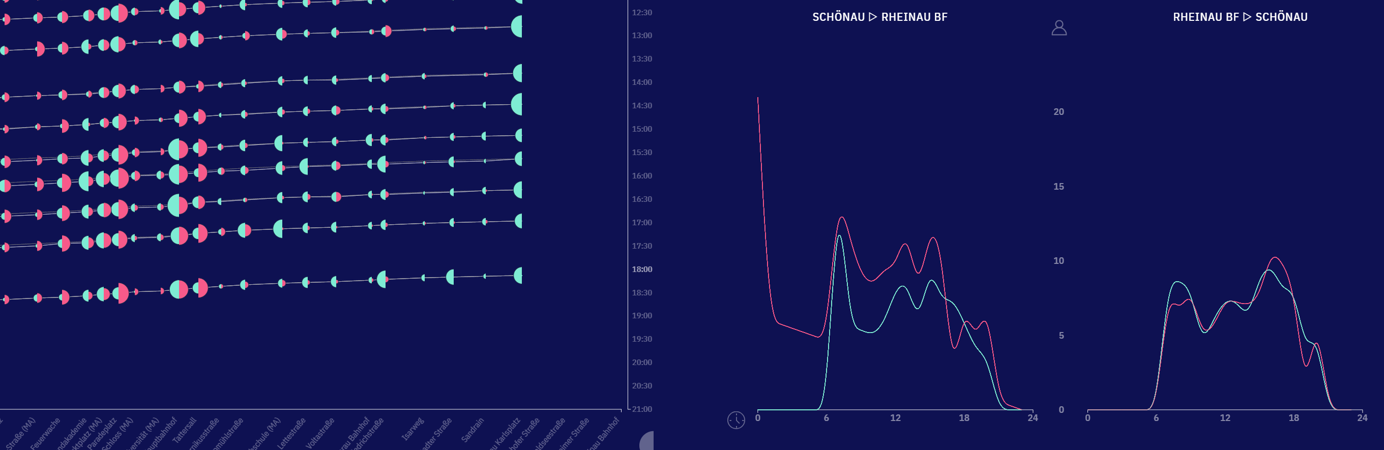
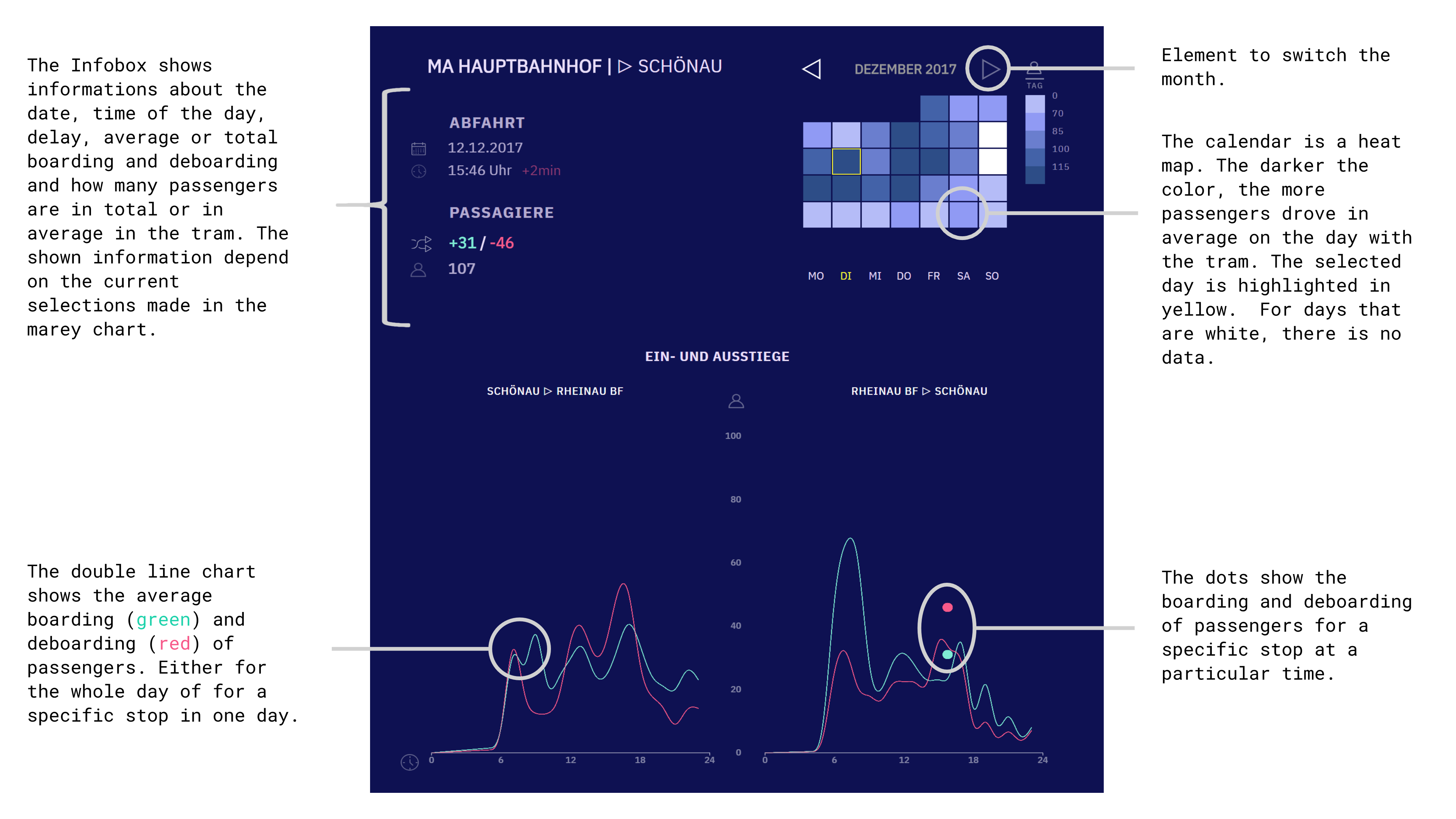
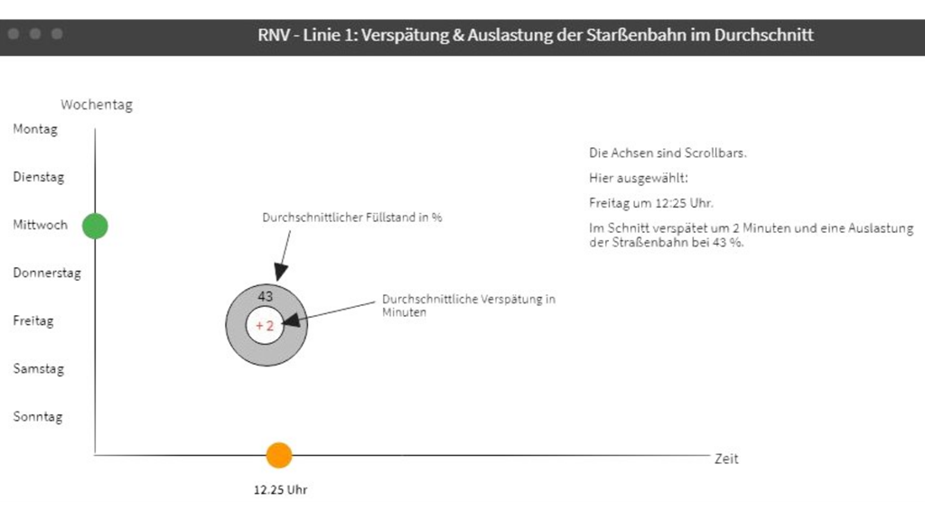
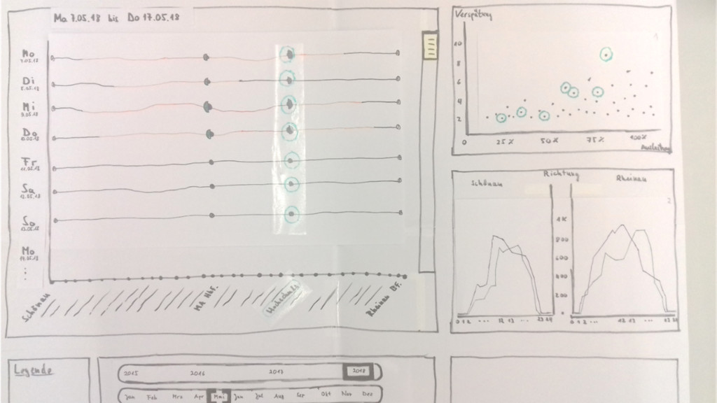
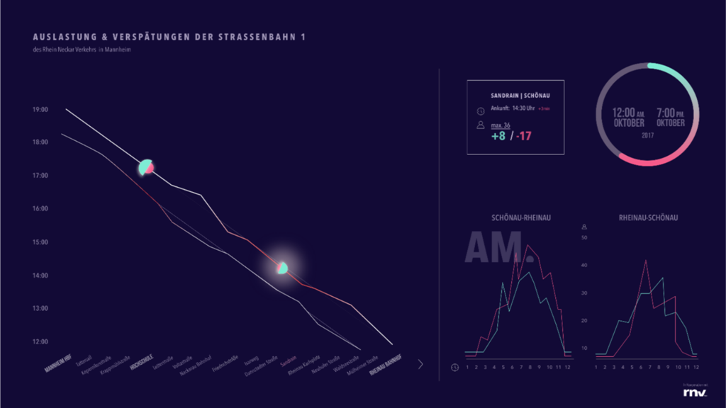
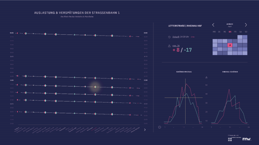
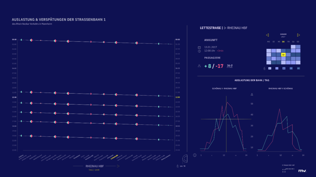
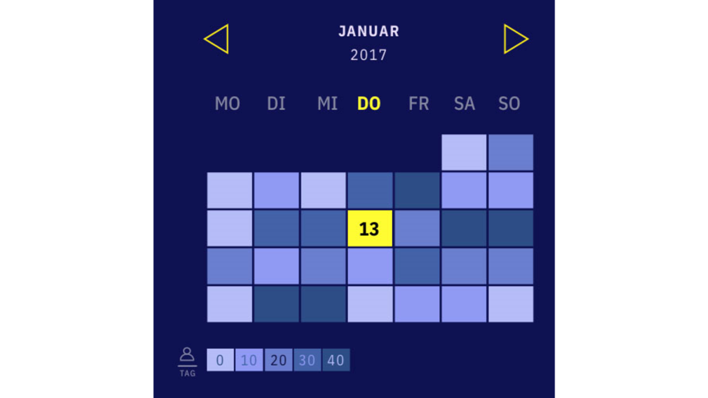
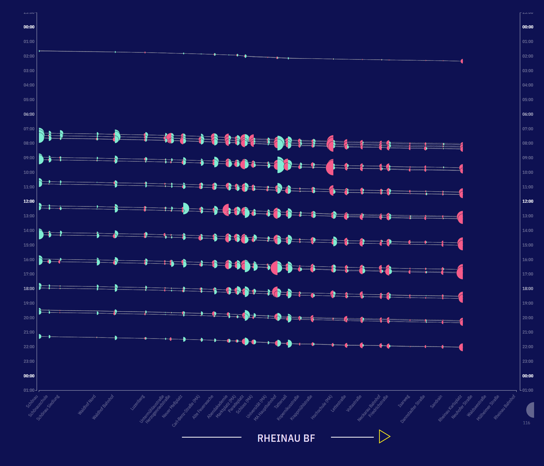
The system consists of an three views:
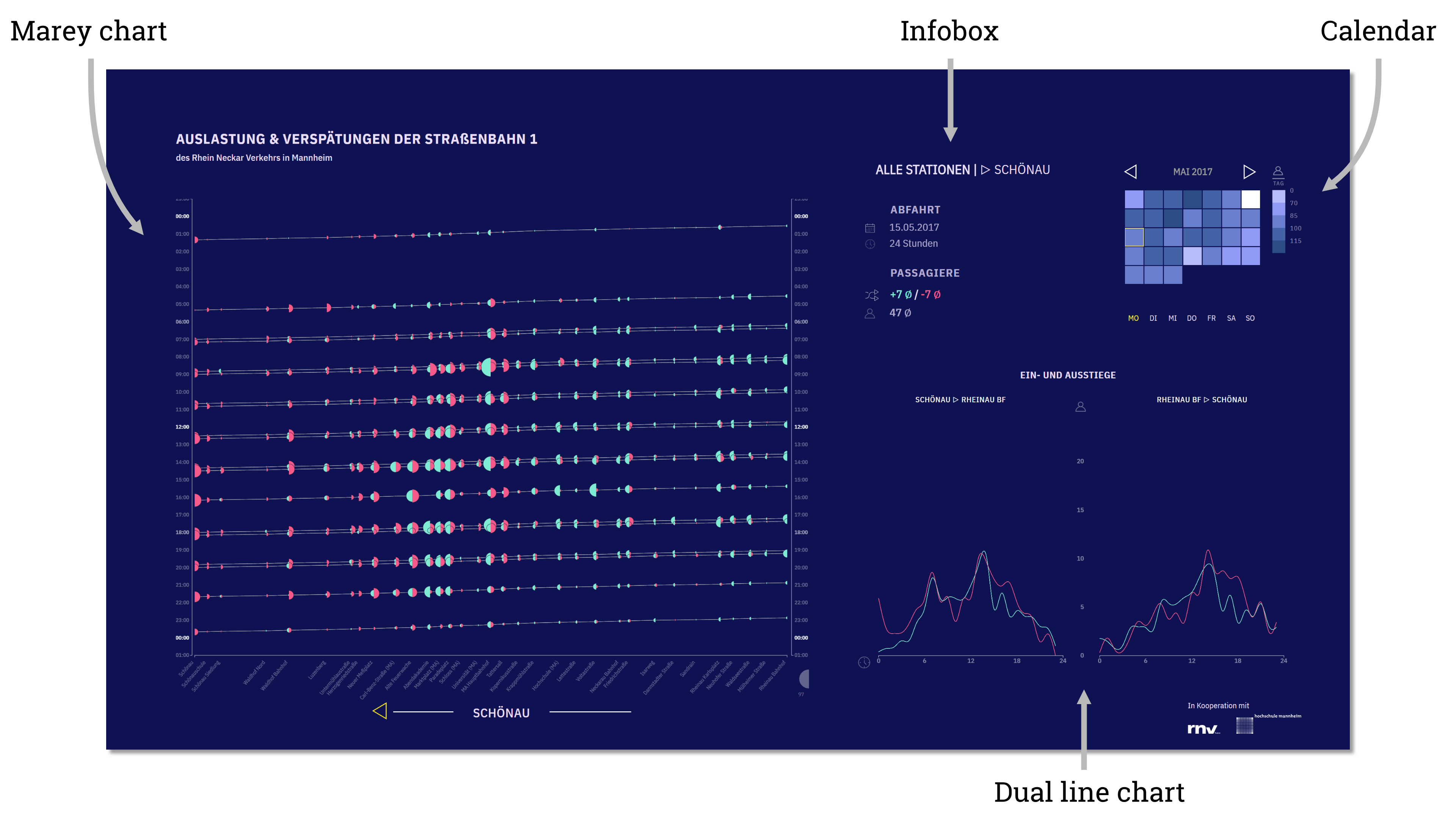
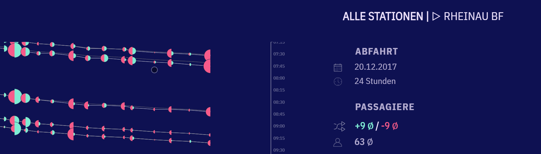
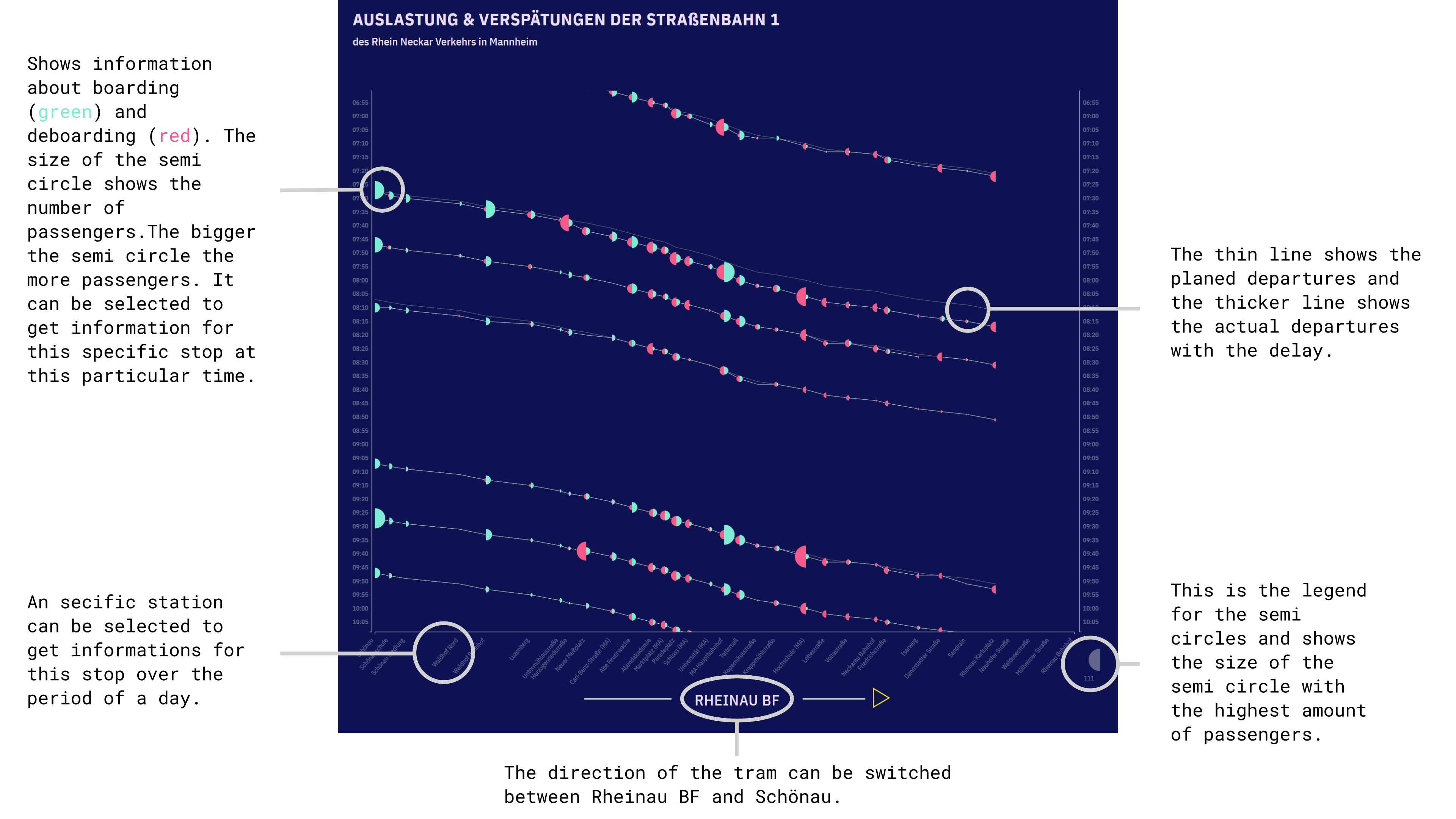
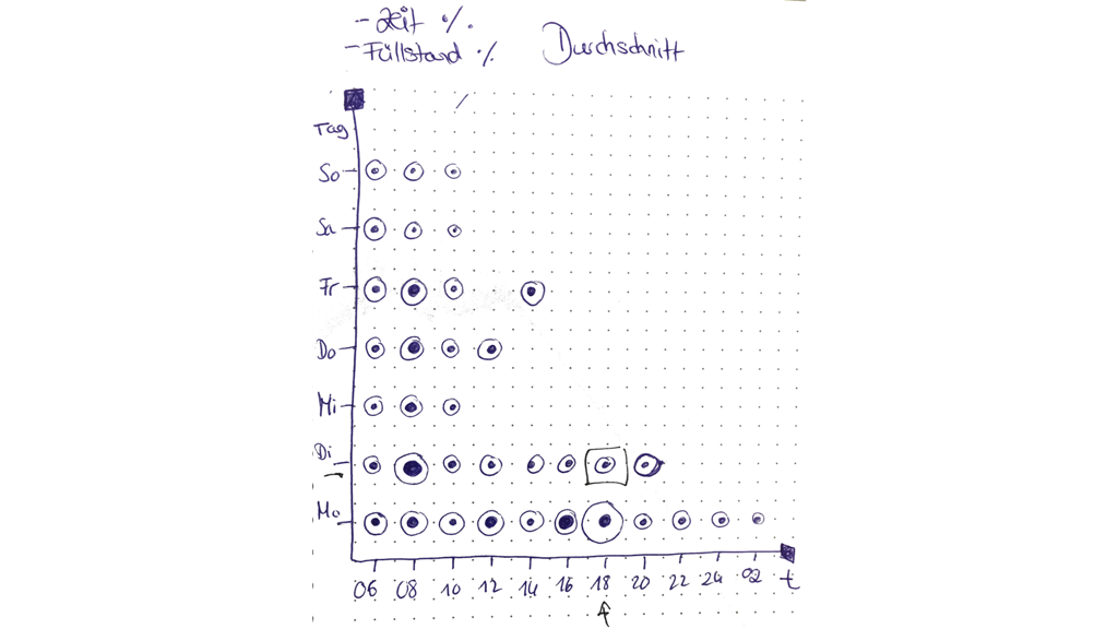
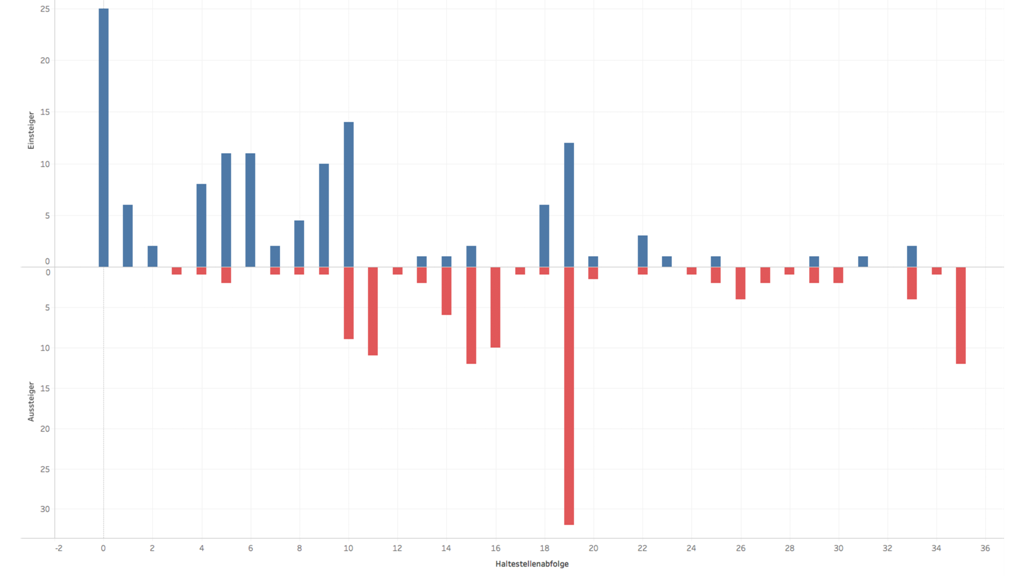
On the top right you can select a day in the calendar view and see some details of the current selections made in the Marey Chart diagram on the left side. E.g. the selected time period, departure time or current load of the tram. On the bottom left you can find informations about (de-)boarding over the whole day and all stops. The biggest and therefore most important diagram is located on the left side. It includes information about delay (position of line) and number of (de-)boarding per stop.
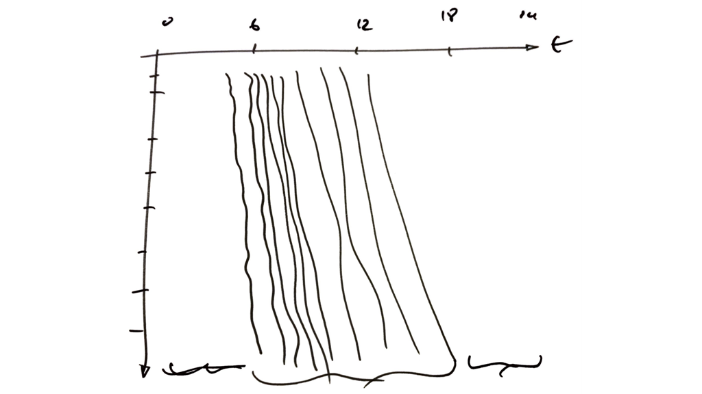
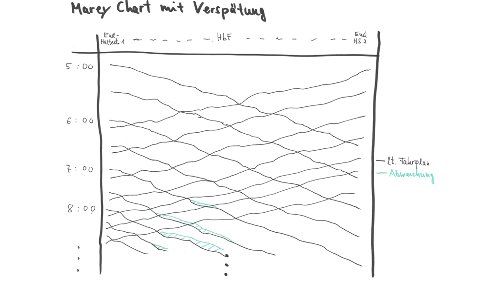
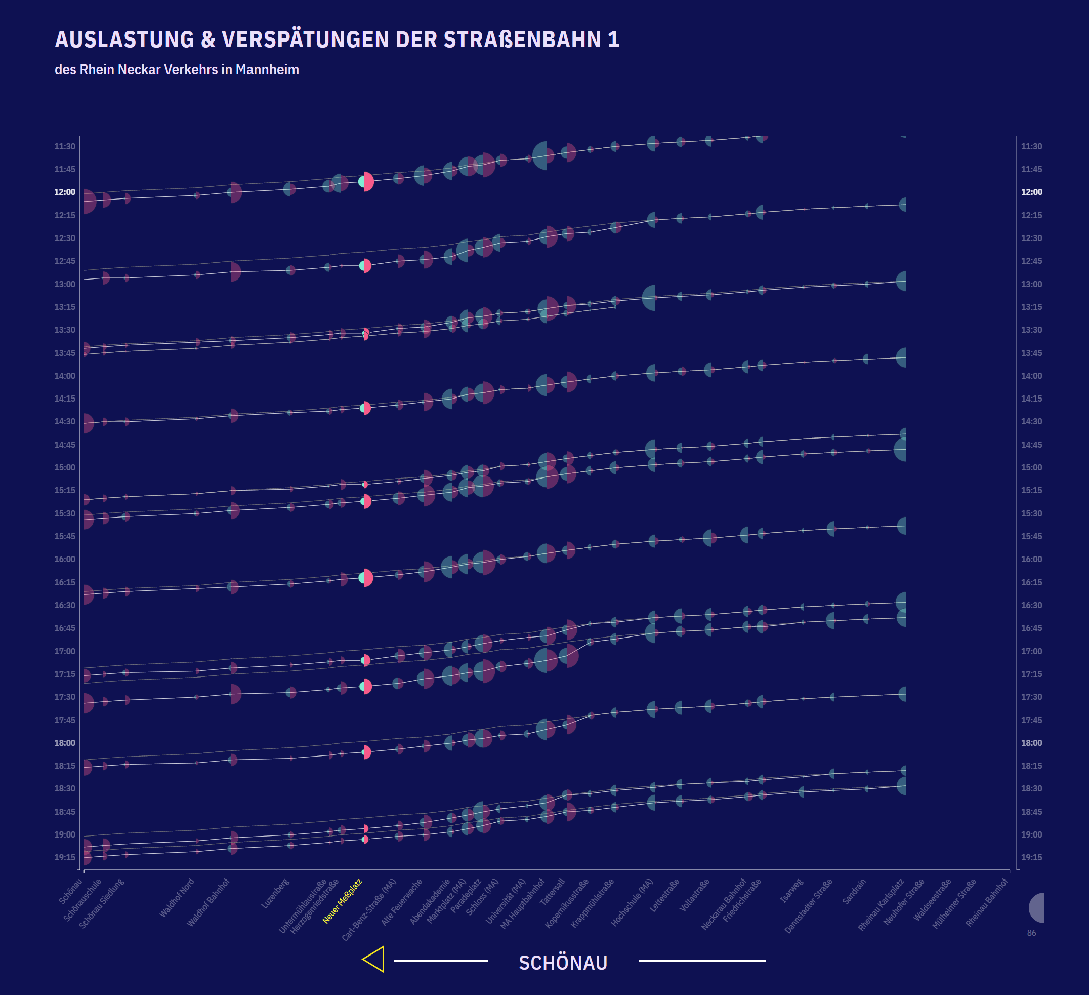
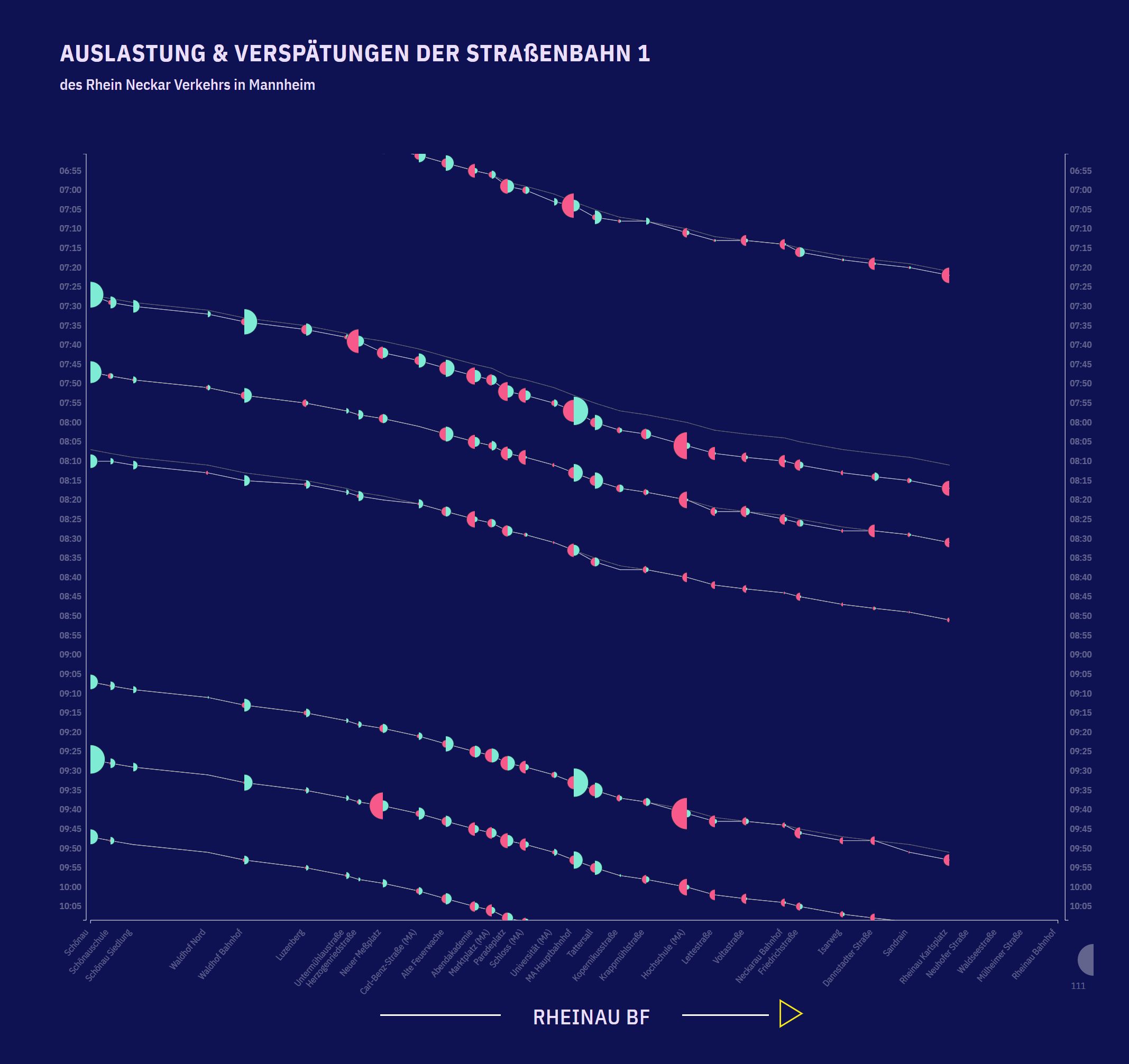
Marey Chart
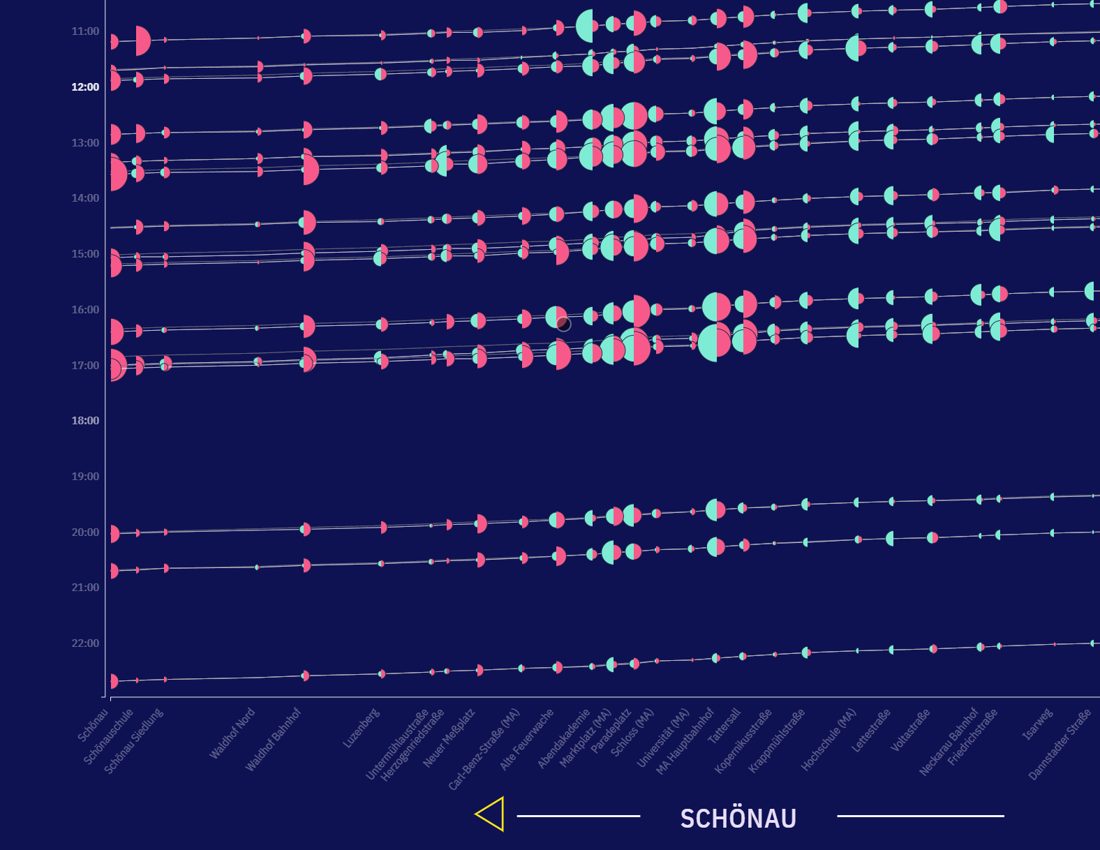
A Marey chart is commonly used to analyse transportation systems and might be older than a century. It shows the times at which a tram stops at stations on its route. By plotting distance against time, the graph is essentially representing velocity. In the PAXMotion project the distance is represented by the station names along the X-axis, and the planned and actual departure time at the corresponding station along the two Y-axis. Each trip represents a line on the diagram and shows the visited stations at their departure times. Sometimes a second line appears for the same trip, that stands for the delays that the tram has.
In addition to the purpose of the investigation, the diagram serves as an interaction tool for the dual line chart. Consequently, stops can be selected for specific trips, or even all trips for a selected station. These interactions will adjust the dual line charts, which opens new perspectives for discovering.
Dual Line Charts
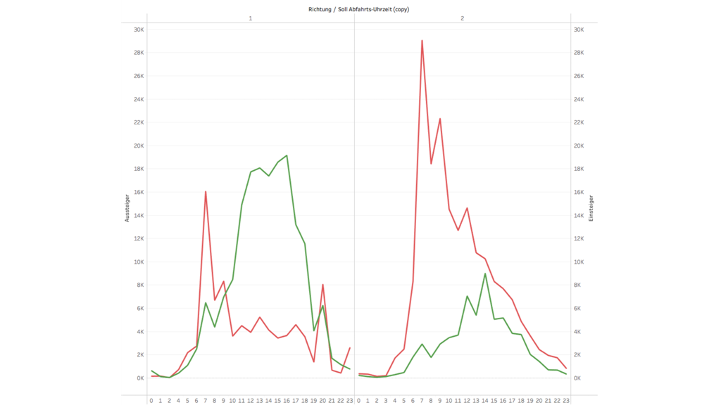
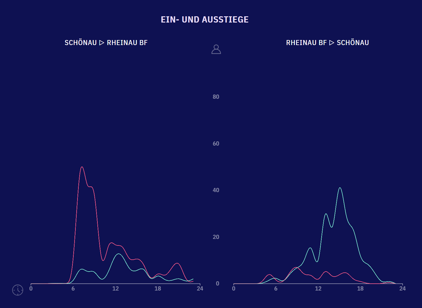
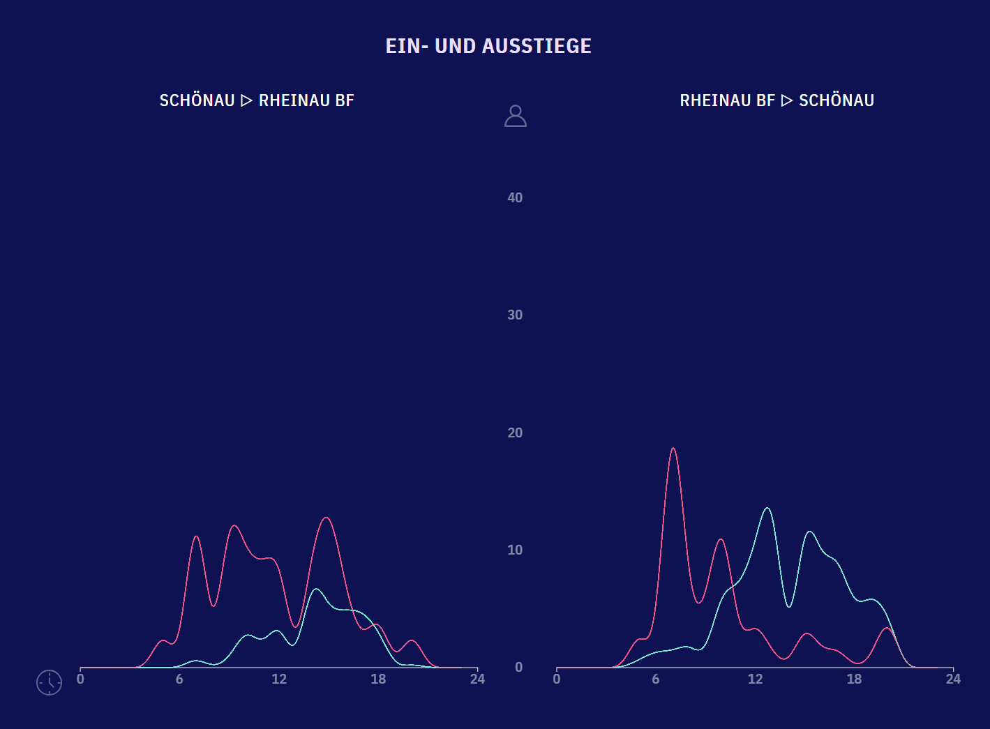
Line charts are represented by a series of data points connected with a line. Line charts are most often used and efficient way to visualize data that changes over time. In the PAXMotion project, two line charts are visualized, one for each direction of the line 1 tram what we call Dual Line Charts. Each of these line charts has two lines that stand for the average boarding (green) or deboarding (red) number of persons per hour. This makes it easy to determine when the greatest activity prevails in one specific direction.
These line charts are interactive, usually information about the selected day are displayed. But if an interaction took place on the Marey Chart, then something happens with the line charts too. For example, if a user selects a specific station on the Marey Chart, the line charts will represent data about the selected station instead of the day. The same applies for a specific day. Unfortunately, the line charts can only represent one interaction at once. If u want to remove your selection, just select the same once more and the information over the day are displayed again.
Hypothese
In a large city like Mannheim, it’s not uncommon that busy traffic can be annoying at rush hours. Therefore, many employees use public transport, to get to work. But not only on the streets can be a large rush, it is also possible that trams could be overloaded and have some delays. This creates some open question, that still need to be clarified. The PAXMotion team has designed several scenarios to establish these, to be substantiated using PAXMotion visualization.
Line Chart
One of the hypotheses is that entry / exit numbers are larger in the morning and in the evening. Most employees get to work in the morning and leave in the evening. Accordingly, the activities on the tram doors should be higher in the morning and evenings, than during the rest of the day. Experience has shown that more people use public transport than at other times, but is this true? For this reason, the team has decided to visualize a line chart, so the time data, at different workday and weekend days, can be effectively compared.
Marey Chart
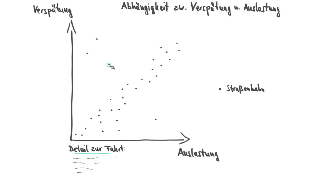
It happens that trams are delayed by a few minutes, reasons for a delay may be technical difficulties or delays caused by people. A further hypothesis that the team has developed is, that a delay can be caused by too much activity on the tram doors. The entry and exit at the stops are not always smooth. Stops at main stations often have more boarding and deboarding activity than other stops, making it difficult to avoid crowding tram doors. However, is that a factor that leads to a delay of trams? In a Marey Chart the reasons for a delay should be recognizable.
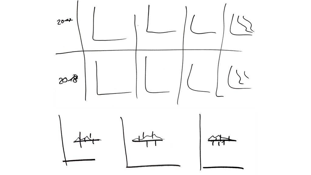
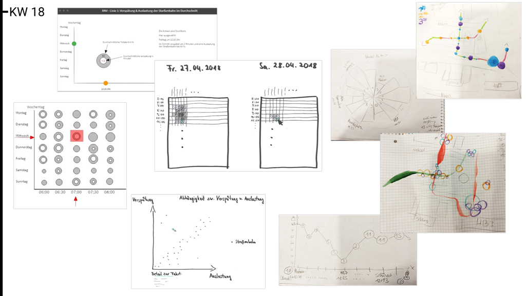
Visualization process
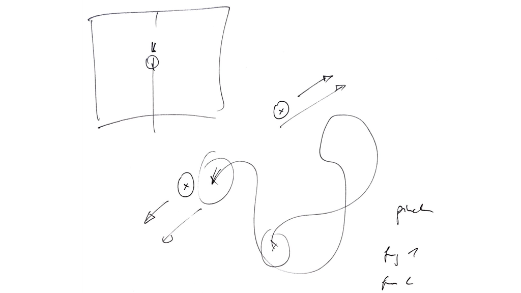
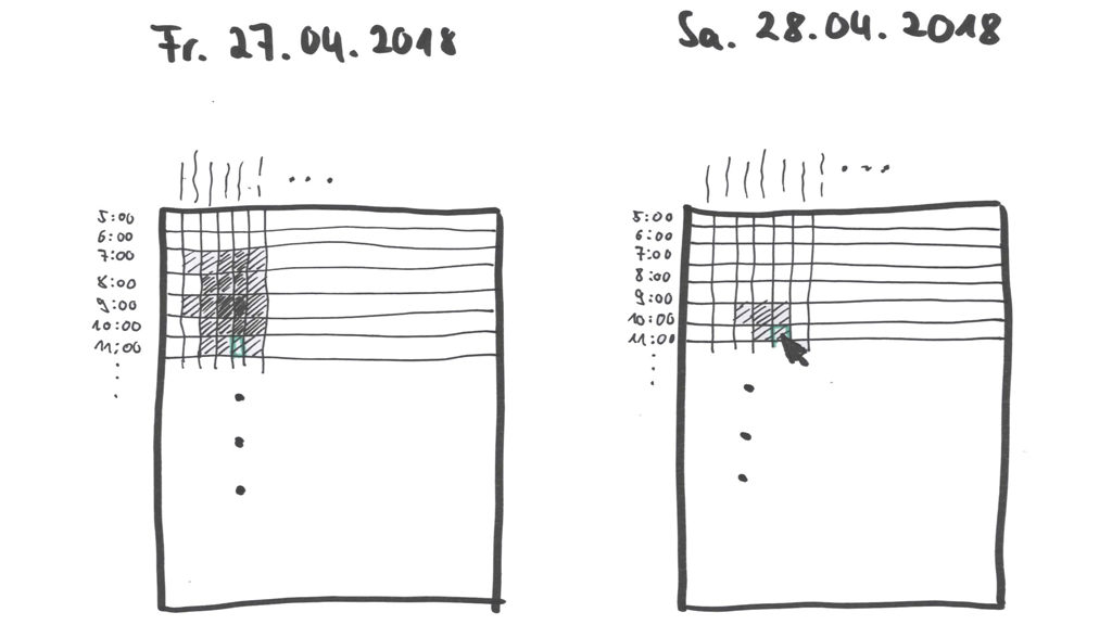
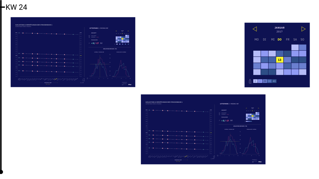
Here you can learn more about the visualization process we went through over the whole project. It began with simple scribbles, went over to a paper prototype and ended with a user interface which was created with design software. Every figure is a slider. The main image represents an overview of a week. You can slide through to see some of the images more detailed.
At the design thinking workshop we developed with employees from the RNV many ideas and brought them to paper, even if they were impossible to create. Many ideas had a map as base visualization because they are very demonstrative. There were also a bunch of ideas of passenger movements.
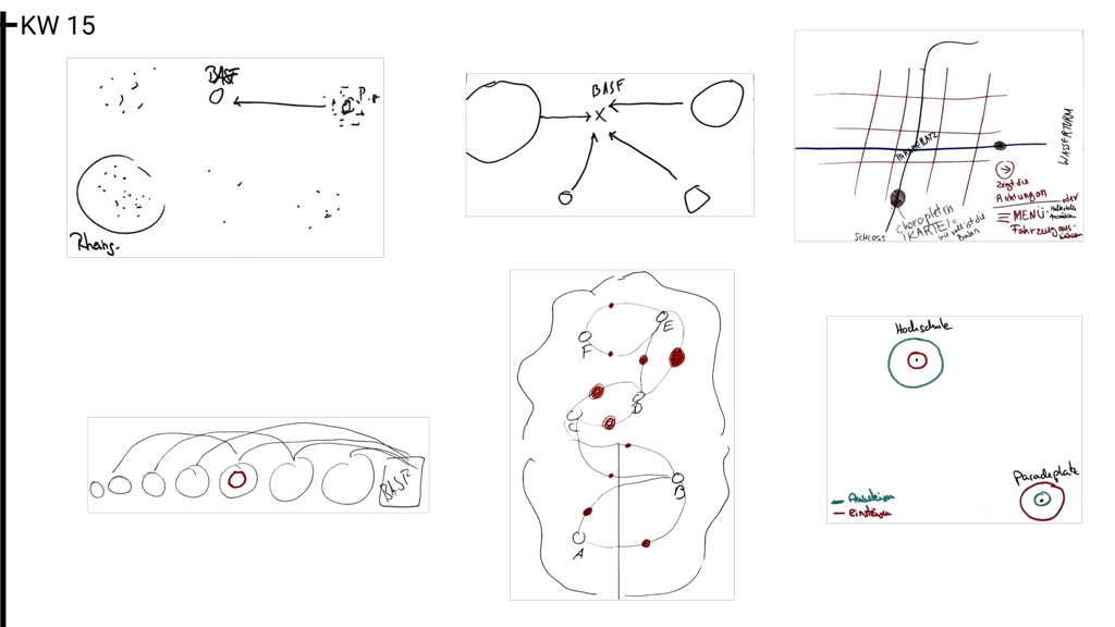
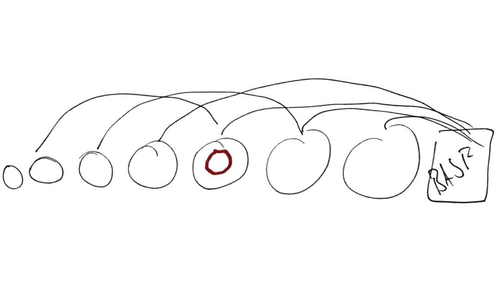
Back at the university we focused on realizable visualizations. Also we thought about which data is unique and therefore more interesting. The RNV gave us data from tram sensors, which are not published at the open data portal. So we knew how many people were inside the trams at any station.
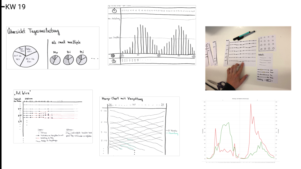
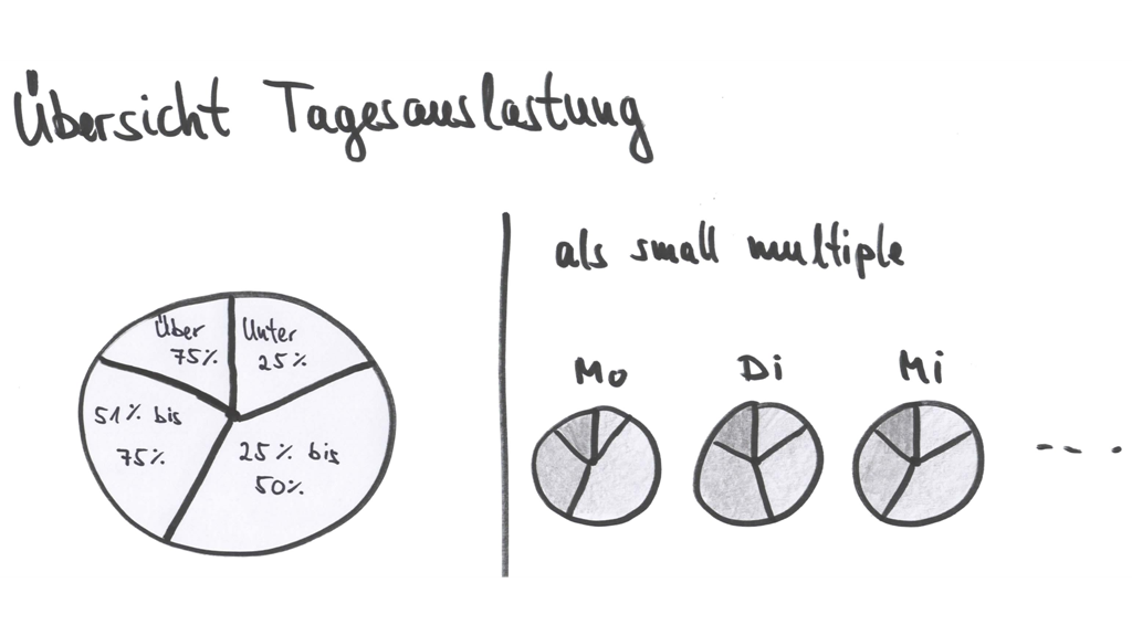
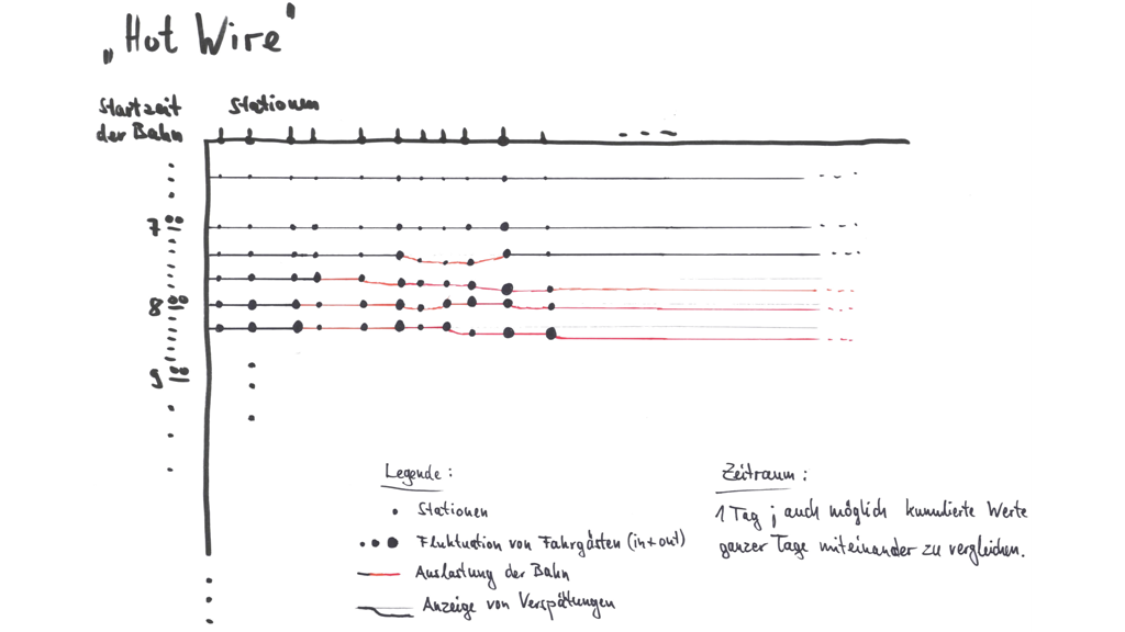
Now with the focus at sensor data we developed more and more line charts and fewer maps. Among other things there were small multiples, Marey charts and a matrix. Also we made first tests with real data and visualized entrances and exits with Tableau.
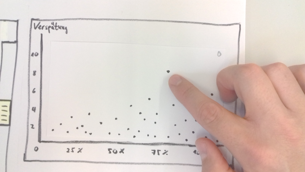
It turned out that another focus was the delay of the trams. As a result the maps began to move to the background. It was difficult to show the passenger traffic and the tram delay simultaneously without losing the overview. A main issue was that you could not differ two trams at the same stop. Now we had many versions of matrices, a scatter plot, variations of a Marey charts and pie charts.
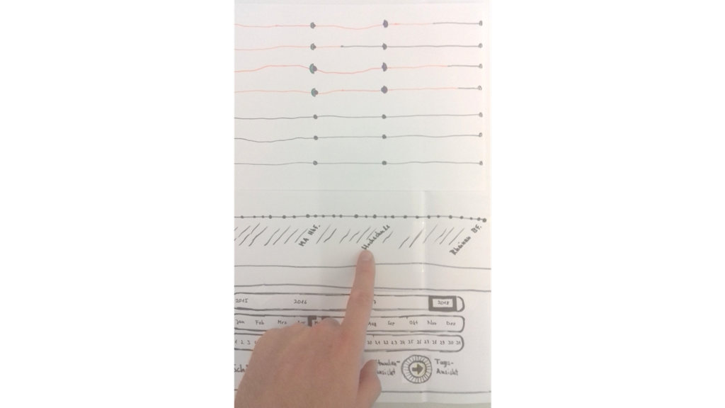
The work on a paper prototype began. So we were able to simulate first transitions and had to think about which views are useful. At the beginning the paper prototype contains a Marey like chart as main chart, a scatter plot, a matrix, pie charts and a time navigation panel. Later the matrix was replaced by a line chart which shows all entrances and exits over a day.
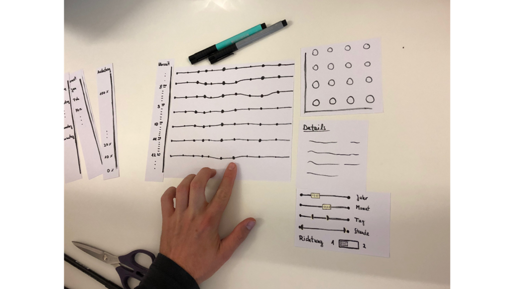
This is the final version of our paper prototype. After we solved most of the issues the work on the user interface with a design software began.
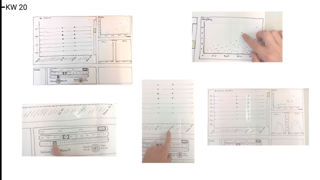
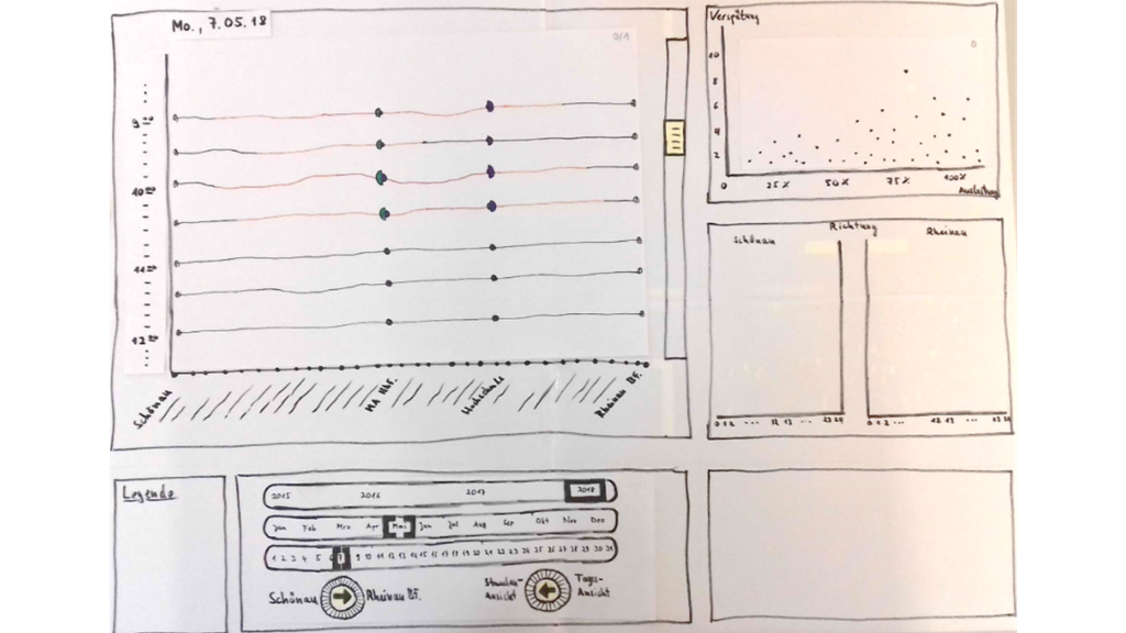
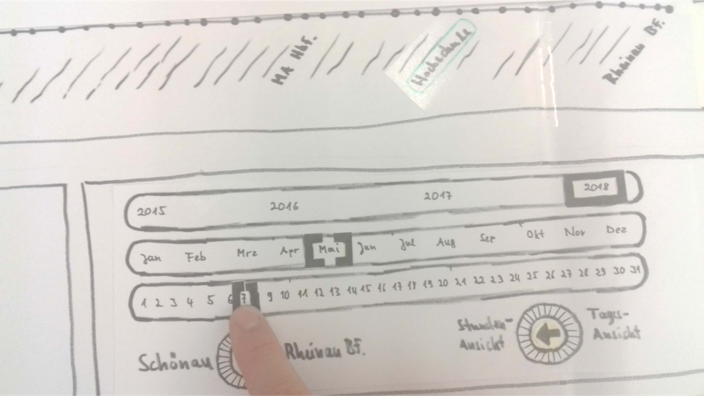
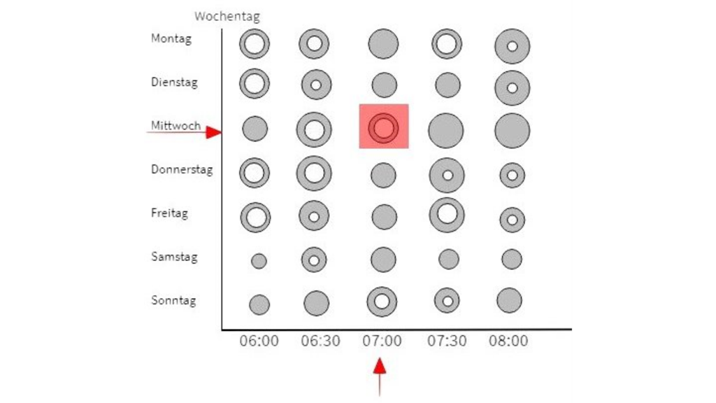
Here are the first designs. The calendar was changed completely during the process. First the view was over a whole year. But it turned out that it took too much space. As solution we changed to a month representing calendar.
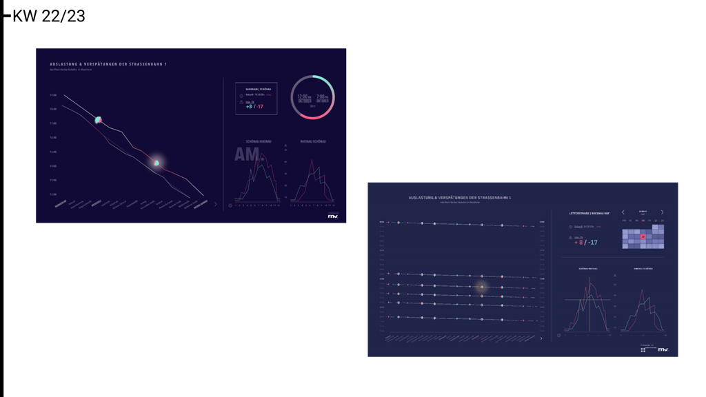
The last design is very similar to the real prototype. There were only small changes.
Data
Data preparation
In the context of local transit huge amounts of data are collected and processed by different applications and systems. For this project we had to primarily ask the question to which kind of data we could get access. The RNV already hosts an OpenData portal with information about tram/bus lines, stations and timetables, but because of the tight cooperation with our project team the RNV provided us additional data that had been collected by door sensors in selected trams. These sensors count the amount of persons entering and leaving the vehicle at each station of the tour.
For our prototype we finally decided to use the sensor data of tram line no. 1 and a data set from a previous project that contains information about delays. While sensor data was available for the time from 2015 to 2017 we decided to only regard data from the year 2017. However, the delay data was limited for a time span of around four weeks in december 2017.
The main challenge of the data preparation was merging the two data sets into a format that holds all relevant information like the amount of persons entering or leaving the tram and the planned departure as well as the delay at a specific station. The designed data structure consists of three tables:
- tours
- tour_data
- stations
tours contains one row for each tour. A tour is a trip of a specific tram from a start to an end station. The start and end stations usually mark the final stops of a tram line. For example Schönau and Rheinau Bahnhof are the final stops of tram line no. 1 and are the most often occurring values in the columns start_station and end_station. The column planned_start_time specifies the time when the tram is supposed to depart at its start station.
tour_data adds to the tours table by providing information about each stop on a tour. For example in most cases the tram line no. 1 has 33 stops from start to finish, so for a tour like this there are 33 rows in this table. Each row contains information about the station (station_id, station_name), time (planned_departure, actual_departure, delay) and sensor data (boarding, deboarding, current_load).
The stations table provides additional information like longitude and latitude for every station in the RNV transit network. This table was directly provided by RNV.
Merging the two main data sets was especially difficult since they don’t share a key that uniquely identifies a tour and both sets have very limited information. For example the delay data has information about the departure at every single stop but only stop no. 1 knows the departure time at the start station. In the sensor data every stop has the departure time at the first station but none of them know the intermediate departures. Because of this we executed a self-join on the delay data adding the departure time at the first station of the tour to each row. After this we were able to join the delay data with sensor data by using the station id, the departure time at the first station and the direction as foreign keys.
INSERT INTO apv.final_data
	SELECT delay.*, s.entering, s.leaving, s.current_amount_persons, s.distance_from_start
	FROM rnv_data s
	INNER JOIN
	(
		SELECT
		    d.planned_departure,
		    d.projected_departure,
		    d.delay,
		    d.station_name, d.station_id,
		    CONVERT(d.position_in_tour, DECIMAL) as position_in_tour,
		    d2.planned_departure as start_time,
		    d2.station_name as start_station,
		    d2.direction as end_station,
		    d2.direction_id,
		    d.tour_id,
		    d.longitude, d.latitude
		FROM delay_data d
		INNER JOIN delay_data d2
		ON d.tour_id = d2.tour_id
		AND DATE(d.planned_departure) = DATE(d2.planned_departure)
		AND d.direction_id = d2.direction_id
		WHERE
			d2.position_in_tour = 0
		ORDER BY d.tour_id, CONVERT(d.position_in_tour, DECIMAL)
	) AS delay
	ON s.station_id = delay.station_id
	AND s.planned_departure = delay.start_time
	AND s.direction_id = delay.direction_id
	ORDER BY start_time, delay.position_in_tour
The result of this query was written into an interim table. Before it was finally split into the tours and tour_data tables an unique tour id was generated using the departure time at the first stop, the start station and the direction id (1 = Schönau, 2 = Rheinau).
With two additional queries the remaining sensor data from the year 2017 was added to the tables. However, this brought the problem that most of the departure times were missing because they were no corresponding entries in the delay data. We solved this problem by creating an auxiliary table containing the difference in minutes between the start stations and every stop after these. With this table we could calculate the departure times and fill all the gaps.
Exploratory data analysis
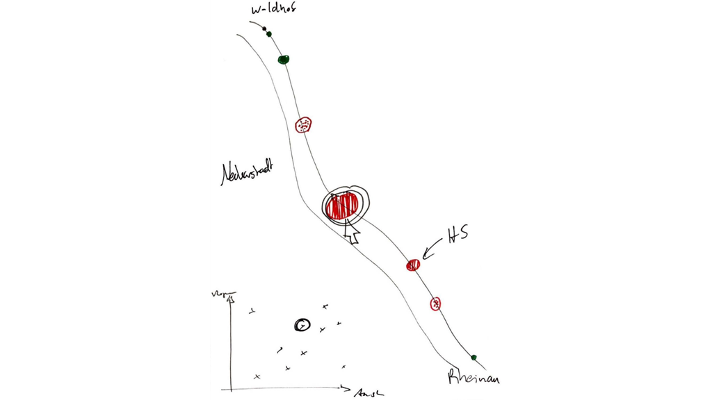
Using the source tables (rnv_data and delay_data), the results from the previous project that collected the delay data and the final data structure we analyzed the information to identify noteworthy patterns and characteristics. For example we know from the previous project that the station Neuer Meßplatz was experiencing a lot of delays on the northbound trains so assumed that there could be a connection to the amount of persons boarding or leaving at previous stations.
–Insert Tableau screenshot here for direction Schönau (Prof. Nagel) –
As seen in the screenshot the stations right before Neuer Meßplatz starting with Paradeplatz have many passengers boarding or leaving the trains. Especially the amount of persons exiting the vehicles quickly increases towards the end of the trip compared to its first half. One could conclude that this is the main reason for Neuer Meßplatz having so many delays, but since the data shown in the screenshot is aggregated over a time span of almost three years it hardly allows to draw conclusions on the reason for the delay of a specific train.
–Insert Tableau screenshot here for direction Rheinau (Prof. Nagel) –
Another interesting aspect is the amount of traffic at the Mannheim central railway station. While it’s usually a lot higher compared to other station, the amount of boarding and exiting passengers is mostly the same. We assume that this is due to the fact, that this station is a popular transfer point and right in the middle of tram line no. 1. A similar observation can be made at the station Paradeplatz. While the total amount of persons going in or out of the vehicle is lower compare to the Hauptbahnhof, there are neither more people boarding nor exiting.
The station Tattersall especially stands out because it breaks the trend of more passengers boarding in the first half of the trip and more exiting towards its end. We conclude that this is because when your destination is Rheinau but you arrive with a different tram line in the city center, Tattersall is the last possible and probably most efficient transfer point for this direction. The same is true for the opposite direction. If you come from Rheinau the station Tattersall is both the first station in the city center as well as your first chance to transfer to another tram line.
Prototype
Development / Tech
Architecture
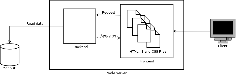
As you can see in the figure above frontend and backend are both on the node server. With this you can access to the frontend with the domain name and see the visualizations. The data for the visualizations are from the database called MariaDB. More details to the technical components are in the lower sections below.
NodeJS
NodeJS is a JavaScript runtime environment that is based on an Input-Output model. It is a server-side platform and hosts network applications. The server-side web application is written in JavaScript.
NodeJS is powerful. You can create dynamic web content with NodeJS. It is also able to connect to a database to add, delete or modify data.
The main advantage of using NodeJS is the Node Package Manager, also known as NPM. NPM is provided by NodeJS and as the name suggests, it
is used to manage different packages in your JavaScript environment. These packages contain the required libraries. They are installed
locally with the command ‘npm install
D3
D3, also called Data-Driven Documents or D3.js, is an open source JavaScript library that is used to visualize data. SVG, HTML5 and CSS are used to realize the visualization process. It is a very popular framework that is used on many websites. D3 provides many many functions to help the interaction between user and website. To name an example, it provides a hover function when you move your mouse over an icon or a click event that gets triggered after you click on something.One of the biggest advantages of D3 is the rendering of the data. With the data being rendered, you don’t need to modify the data anymore.
MariaDB
MariaDB is an open-source database management system. It is a relational database and is widely used. It is known for structuring data for many use cases. The main characteristics of this database are its speed in processing data, scalability and robust system. That’s why this database is one of the most popular relational databases. Another point that many users like about MariaDB is the interface for SQL-Queries it provides. The last benefit of using MariaDB is the possibility to save or generate columns with the datatype JSON. This feature allows you to save JSON without being forced to use a NoSQL database management system.
Bootstrap
Bootstrap is an open source frontend CSS framework. When using Bootstrap you don’t have to define a lot of CSS classes since it provides its own classes for buttons, tables etc. One of the main reasons to use Bootstrap is the support for responsive design. Responsive Design enables the support of the layout on different devices. For example, if you resize your browser window, all elements adjust their size to the new window size. Bootstrap is one of the most popular frameworks to design the frontend. So if you want your application to look ‘good’ on different devices, Bootstrap is the way to go.
jQuery
jQuery is an open-source JavaScript library. It is one of the most popular JavaScript library and it is platform independent.The main core feature of jQuery is the DOM(Document Object Model)-navigation and manipulation. With this you can access to HTML objects.
Tableau
Creative ideas or vizualisations were implemented by the software Tableau. With Tableau you can transform data in a more “readable” way, so let’s say instead of having a huge table with a dozen rows of data you have an illustration that properly portrays the data.
With Tableau you can create interactive analyses and see the values of the data. Furthermore you can create interactive dashboards and load data with SQL, Hadoop or other data storage systems.
Selected Insights
Our project would not be completed without the insights gained. Since the goal of a visualization is to gain insights to be able to act accordingly. Also in this project we have gained some insights that will certainly help RNV to improve their planning. Some findings are trivial and have confirmed our expectations, but there are also some findings that either exceeded our expectations or did not meet our expectations.
Overview
We tried to identify patterns based on the visualization results. In the overall view on a working day you can see general patterns. We distinguish between temporal, spatial and temporal-spatial trends.
Temporal trends
The screenshot shows that there is more activity in the morning than in the evening. Our assumption would have been that in the morning and in the evening is about the same amount of activity. But it is understandable that there is more activity in the morning, as most people have to go to work/school/university early. But go back home at different times.
Spatial trends
In this screenshot you can see some rough spatial trends. At the early stations many passengers get on and at the later stations many passengers get off (at the other direction, of course the other way around).
Temporal-Spatial trends
Also some temporal-spatial patterns are recognizable. For example, there are stations where activities such as the city centre and the main train station take place throughout the day.
There are also some patterns recognisable as outliers such as the Waldhof railway station or the Mannheim University of Applied Sciences. Waldhof has many entrances and University of Applied Sciences has many exits in the morning.
Deeper Understanding
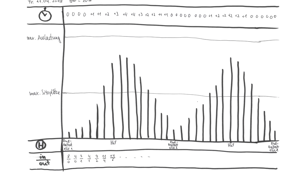
In the project to investigate delays it emerged that “not at Paradeplatz, but at the Neuer Messplatz” most delays occur (Mannheimer Morgen, 24.01.2018) In PAXMotion you can now see that this is true, but the delays are not necessarily caused at this stop. The selected screenshot shows that the delay starts at the first stop (Schönau) and that the train usually makes up for the delay to Paradeplatz.
Interrelation between Delay and Activity
Some delays can already be seen in the overall view of the day (around 1 pm at the end of the line). After you have zoomed in, you can also examine the connections between getting in / out and delays. For example, the screenshot shows that the delay increases in the morning from Herzogenriedstraße. This may be due to the higher drop-out numbers of pupils who have to go to Gesamtschule Herzogenried.
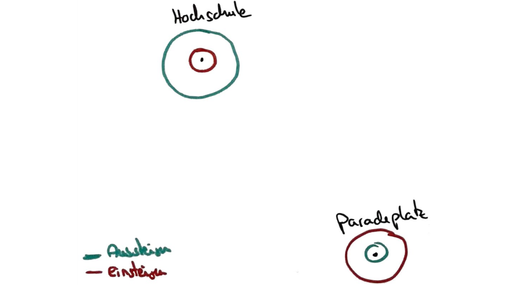
University of Applied Sciences (Hochschule Mannheim)
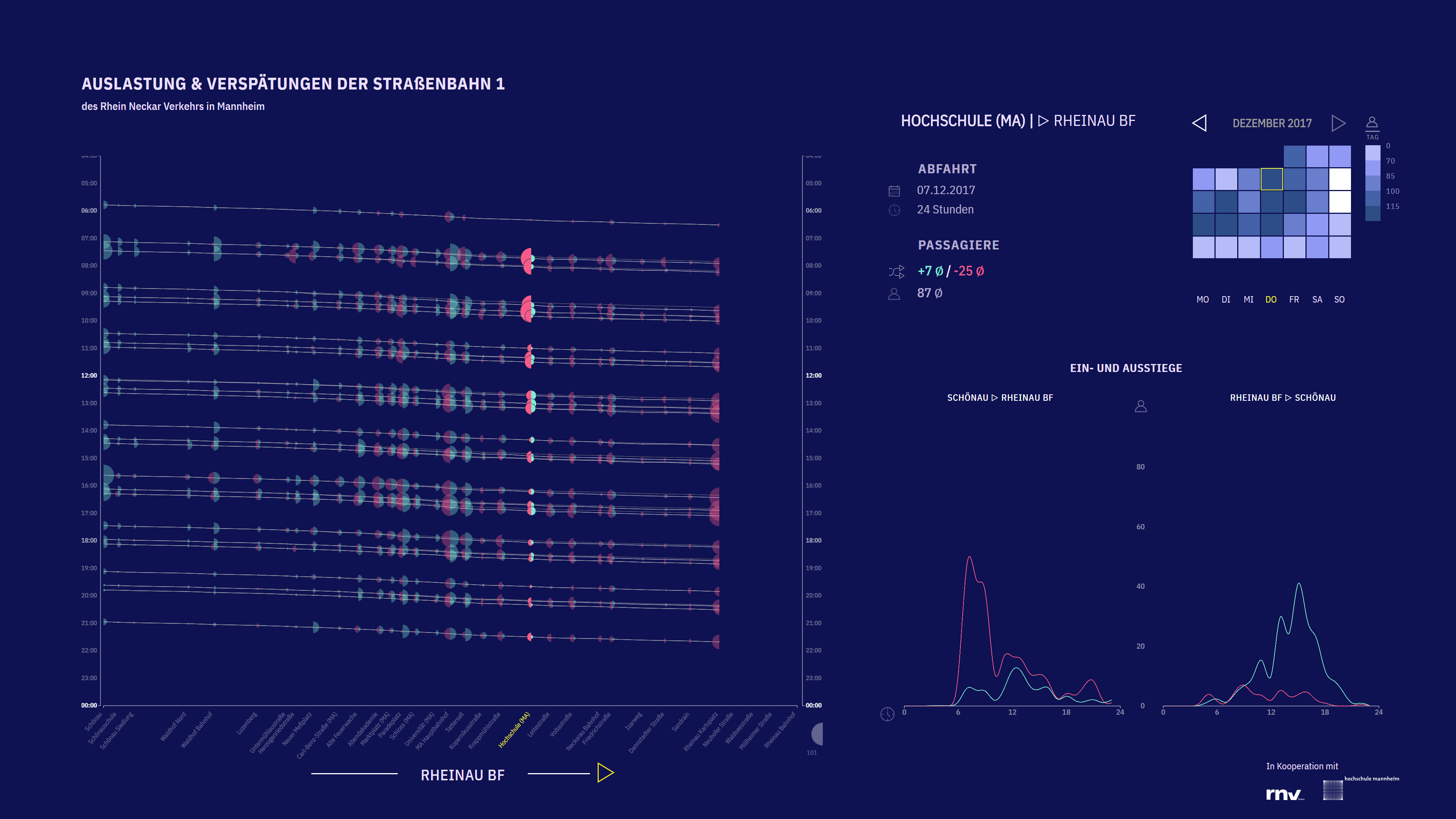
When we look at students at our university. First it is noticeable that the station has significantly more exits in the morning than other stations. After selecting the station as one can see in Fig. 19 this is confirmed (see average values in the info box. 10/-10 total, and +7/-25). If you now change direction, you will actually see the opposite behaviour in the afternoon. These time trends can also be seen directly in the dual line charts. Many students go to the University of Applied Sciences in the morning and back home in the evening.
During the examination phase, the Dual Line Charts (Fig. 21) show that the passengers boarding and deboarding are more distributed throughout the day than during normal lecture times. This is probably due to the different examination times. Students come to the exam and then go back to their homes.
Team
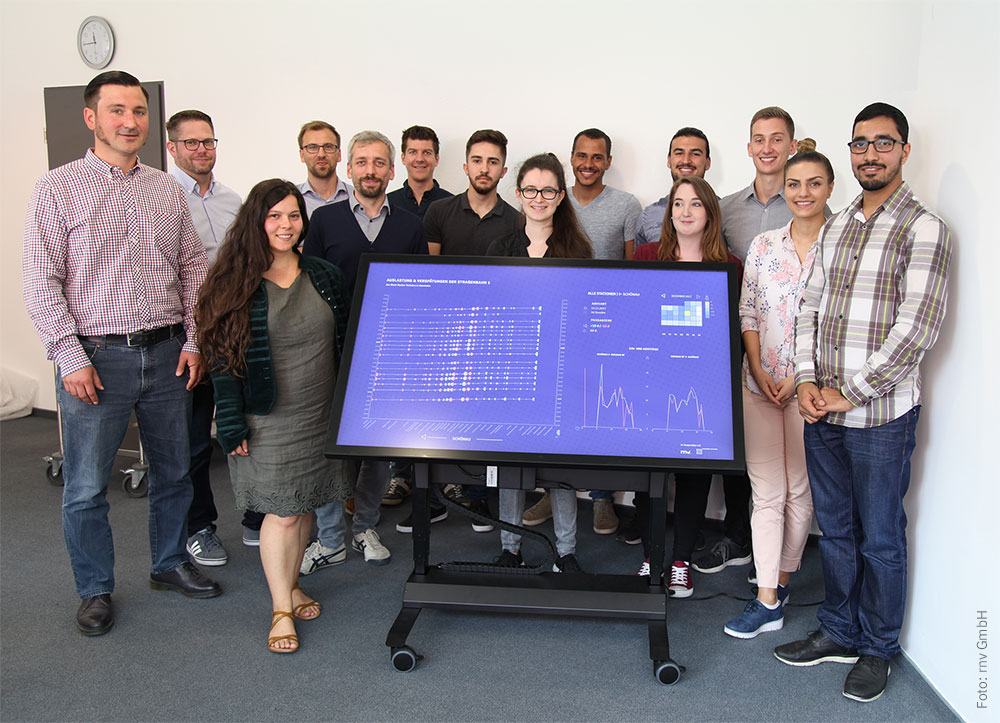
The development team consisted of 10 students from 3 different courses and their professor Dr. Till Nagel.
Feedback
Article in Rhein-Neckar-Zeitung
Article in open data portal of Rhein-Neckar-Verkehr GmbH
Press report of University of Applied Sciences Mannheim
Credits
[Hier können Sie Ihren Namen angeben, und eine URL verlinken. Angaben sind freiwillig!]
Daud Nasir
Betra Meier
Supervision by Prof. Dr. Till Nagel
PAXMotion is a student research project from the University of Applied Sciences Mannheim, in cooperation with the Rhein-Neckar-Verkehr GmbH.
© 2018 Till Nagel and team, University of Applied Science Mannheim